Howdy! Yup, you guessed it… This site is definitely a work in progress. I’m working on getting everything set up, so thanks for your patience.
My new site…
Hey there!
Thanks for stopping by, I’m Brian Stigall. I’m a Web Developer/Graphic Designer based in San Diego, Ca. I’m experimenting with a new look for my site and business and should have everything going shortly here.
Mom & Dad’s card.
This is a business card I designed for my parents. They are “RV-ers” so this was fun way for them to be able to give their travelling friends their information. The seagull has always been significant to my pops and both my mother and him are into trains and lighthouses so this was a little bit of everything they are into.
LG Dare Flash Ad
The almighty WordPress plug-in.
This is for you wordpress beginners out there. I’ve mentioned plug-ins for wordpress before but I just want to reiterate that they will become your best friend. If you want your site to do something and you just can’t find a setting that does it, go plug-in fishing! I pretty much guarantee that there will be a plug-in that does exactly what you are wanting to do. No matter how big or small what you are wanting to do is, there is gonna be a plug-in that does it for you (and it will definitely be the easiest way to do it too!)
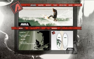
Avila Surfboards Website
This was a class project to design a website for a real client in Adobe Flash. The client had some stipulations such as, we were to use their logo and color scheme and they wanted a particular image used for the background image. They had a set size and wanted particular pages created. This is my first site created entirely in Flash.
Click here to visit site: Avila Surfboards.
Air Application

This was a project whose goal was to produce an Adobe Air Application using Adobe Flash. It integrated video, Flash, and Air technologies. The final product is a fully functional Air application meant to introduce viewers to my portfolio.
Click here to download: (Disclaimer… this application must be downloaded and installed to view.)
airProject.air
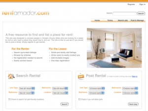
Rent Amador Website
This was a project where, as a team we were to redesign an existing Application based website. Our intent was to redesign any number of residential rental listing sites. This one is specific to Amador county but will eventually be available anywhere. I specifically worked on the usability (testing and application.) The design and PHP was done by James Hills.
Designers… Mind your P's and Q's
Burger king just offended 2 countries with a new print and TV commercial campaign.

Wow! They didn't think that this would be offensive?!?!
Here’s the commercial ad… BTW the Spanish government is trying to get this pulled in Spain right now.
http://www.youtube.com/watch?v=CwpNQWrD8PY
Really? Nobody through the many steps that a design goes through thought that this might offend a few people? This would be pretty damn funny if they hadn’t made the “Luchador” a small person. But seriously, this is a stark reminder that what some people may find funny, others might just want to hunt you down in a large group with pitchforks and torches! I can’t help but think about our recent talks about market research and user testing. A commercial goes before a bunch of people before it ever makes it to air and a poster gets seen by a lot of people before it goes on display in public. Did they think to ask the Spanish community to look at this? I am honestly stunned when things like this happen this day and age. How’s about you?
Lighting a website, a subtle art?

Ok, why am I showing you an apple? Who ever thinks about lighting when building or designing a website? Actually, quite a few people do and it makes a big difference. As one who sometimes struggles with getting going and where to go once I do get going this was a nice article about how thinking about how lighting works in the real world can make a website really pop, or give it that wow factor, or even be good enough that people don’t even notice it (which is when you know you’ve really nailed it!) Check out this article from the always great Smashing Magazine.


