![]() This was one if my first forays into flash. I had just gotten an LG Dare and so when given an assignment to create an animated ad in flash this seemed like a great choice.
This was one if my first forays into flash. I had just gotten an LG Dare and so when given an assignment to create an animated ad in flash this seemed like a great choice.
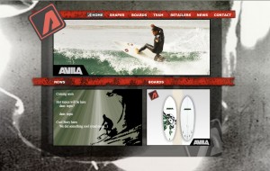
Avila Surfboards Website
This was a class project to design a website for a real client in Adobe Flash. The client had some stipulations such as, we were to use their logo and color scheme and they wanted a particular image used for the background image. They had a set size and wanted particular pages created. This is my first site created entirely in Flash.
Click here to visit site: Avila Surfboards.
Air Application
This was a project whose goal was to produce an Adobe Air Application using Adobe Flash. It integrated video, Flash, and Air technologies. The final product is a fully functional Air application meant to introduce viewers to my portfolio.
Click here to download: (Disclaimer… this application must be downloaded and installed to view.)
airProject.air
Zoo Poster
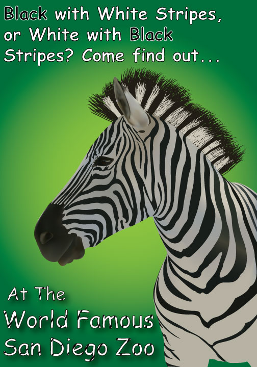 This was one of my first Adobe Illustrator projects. The goal was to produce a poster for the San Diego Zoo where the main focus was an animal created using gradients and the gradient mesh tool. I thought a Zebra would present an interesting challenge and cause a large amount of meticulous work… Turns out, it did. I was seeing stripes for days!
S.P.O.R.T. Center Website
This was a Web-Campaign project. The goal of this project was a web based marketing campaign for a fictional company. Primary tasks were to develop a corporate idendity (Logo), and create a multi-page site containing company info and contact form, and Email blast info page.
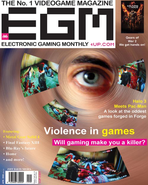
Magazine Cover
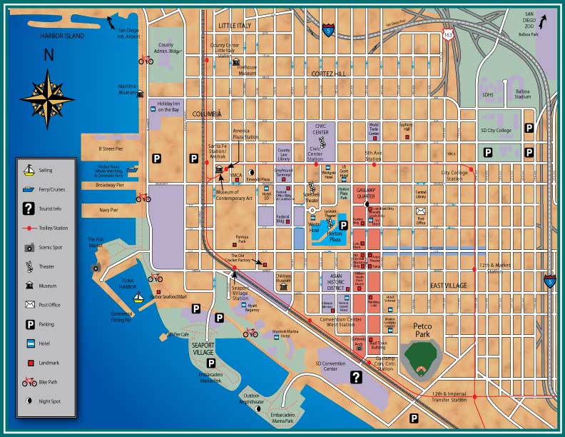
San Diego Downtown Map
Camaro
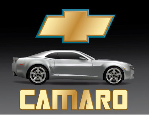 This was an Adobe Illustrator project. The goal was to create an object using gradients and the gradient mesh tool. I chose to re-create a Chevy Camaro because I thought the lighting and metallic texture would present a good challenge. I always like to challenge myself, especially while learning. I think that it helps the technique “sink” in more that way.
Fur Campaign
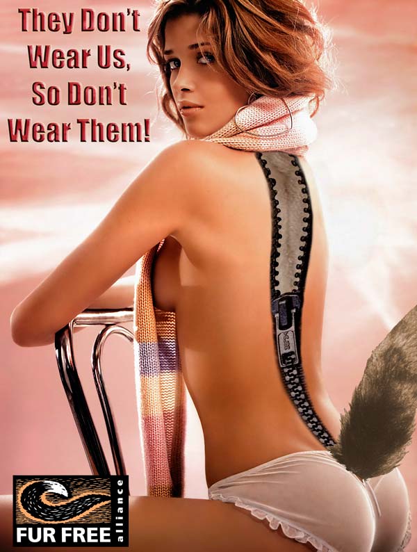 This was an anti-fur class project. We were to design a poster for the Fur Free Alliance. The goal of the ad was to disuade people from wearing fur with vivid imagery. My concept was to have a beautiful girl on the poster, but make it appear as if an animal was wearing her as skin. The tag line says it all, “They don’t wear us, so don’t wear them!”
Ace Locksmith
This is was a re-design of an existing site done for a class project. We were to find a site and give it a face lift. It was required to have a contact form in it and this was one of my first implementations of one.
Click here to visit site mock up: Ace Locksmith
.jpg)
.jpg)